


Have you ever fallen in love with a paint swatch and then immediately panicked? Like, “This is stunning… but will it haunt me at night?” You’re not alone. Bold paint colors can instantly elevate a space with personality and drama—but when done wrong, they can make a room feel heavy, dark, or downright claustrophobic.
I’ve experimented with plenty of daring shades over the years. Some turned my rooms into magazine-worthy moments; others made them look like themed pop-up shops gone wrong. So believe me when I say this: bold colors can work beautifully—without taking over your entire home.
Let’s talk about how to bring the drama without the regret.
Why Bold Colors Work (Even When You Think They Might Not)
Bold hues often get blamed for being “too much,” but that fear usually comes from imagining walls that feel loud and relentless. In reality, the right bold color creates contrast, emphasizes architectural details, and adds layers of depth that soft neutrals just can’t deliver.
There’s a reason designers constantly repeat that color adds dimension—it genuinely transforms how a space feels and functions. Used thoughtfully, bold paint becomes a design tool, not a risk.
Bold Doesn’t Mean Busy
Choosing a bold shade doesn’t mean signing up for visual chaos. When you’re intentional, bold colors can create:
- Warm, cocoon-like comfort
- Dramatic, upscale backdrops
- Playful energy with personality
—all without turning your home into a rainbow overload.
The real secret? Balance.
Drama works best when it’s grounded by:
- Neutral elements
- Layered textures
- Proper lighting
- Plenty of negative space
Bold color alone isn’t overwhelming. Bold color paired with smart design choices is where the magic happens.
The Best Bold Paint Colors That Add Drama Without Overwhelming
Let’s break down standout shades that make a statement while still feeling livable.
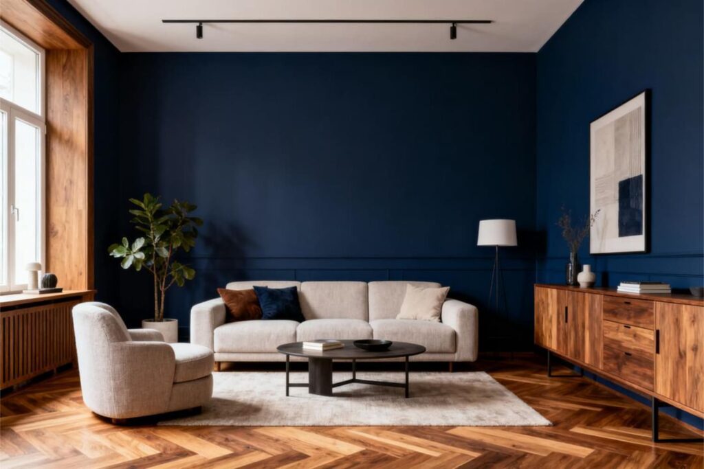
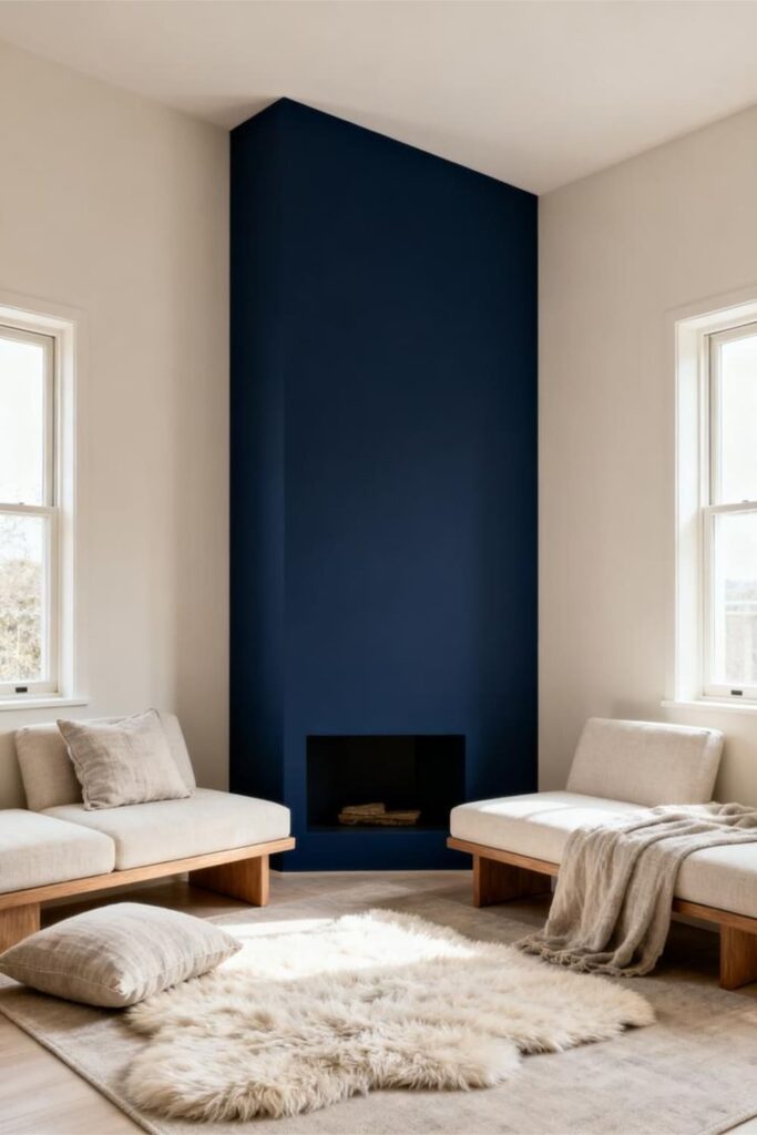
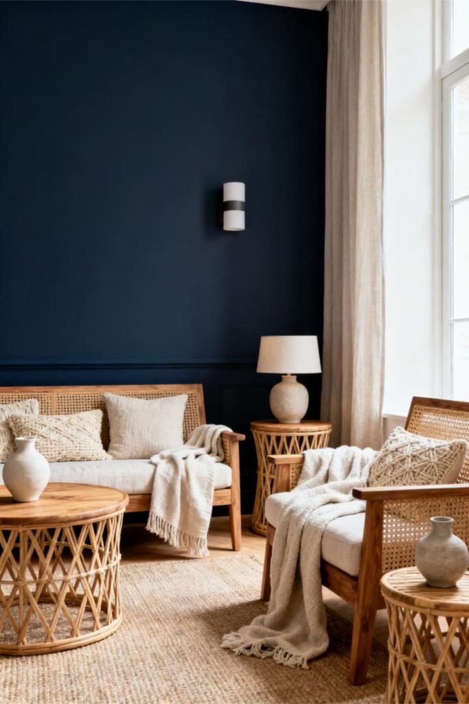
1. Deep Navy: The Unbothered Showstopper
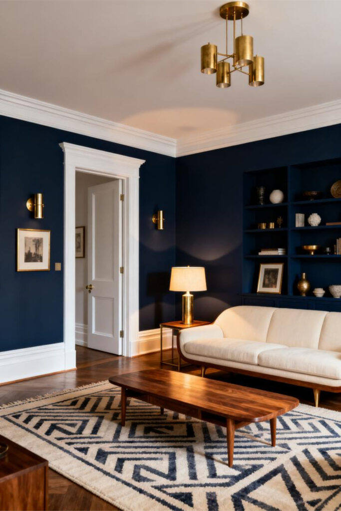
Deep navy brings instant sophistication without the heaviness of black. It’s dramatic, yes—but also calm and refined, like someone who always looks put-together with minimal effort.
Why Deep Navy Works
- Absorbs light just enough to feel rich
- Pairs beautifully with brass, wood, white, and bold artwork
- Creates striking contrast without visual stress
Where Deep Navy Shines
- Living room accent walls
- Kitchen cabinets (a total standout)
- Bedrooms for that luxe hotel feel
Pro tip: Use warm lighting so navy doesn’t skew cold.
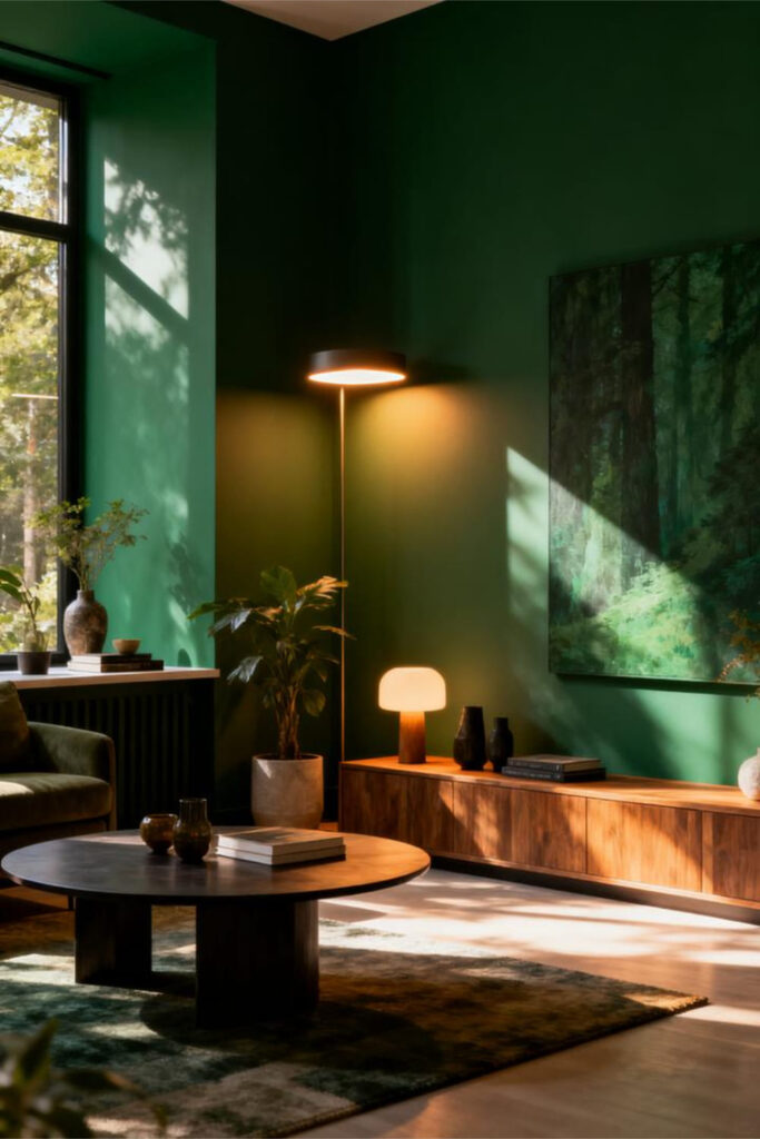
2. Forest Green: The “I-Go-To-Farmers-Markets” Color
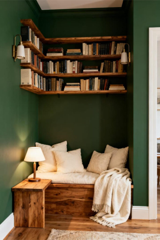
Forest green delivers depth with an earthy, grounding presence. It’s bold but calming—one of those rare shades that feels luxurious without trying too hard.
Why Forest Green Works
- Adds warmth with an organic edge
- Pairs effortlessly with gold, cream, and natural wood
- Feels strong yet soothing
Best Spots for Forest Green
- Dining rooms
- Reading nooks
- Entryways
This color instantly makes a space feel intentional and elevated.
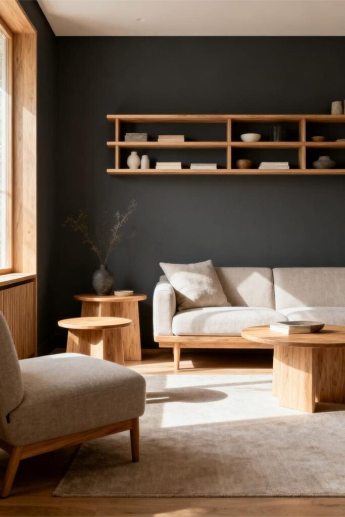
3. Charcoal Gray: The Moody Minimalist
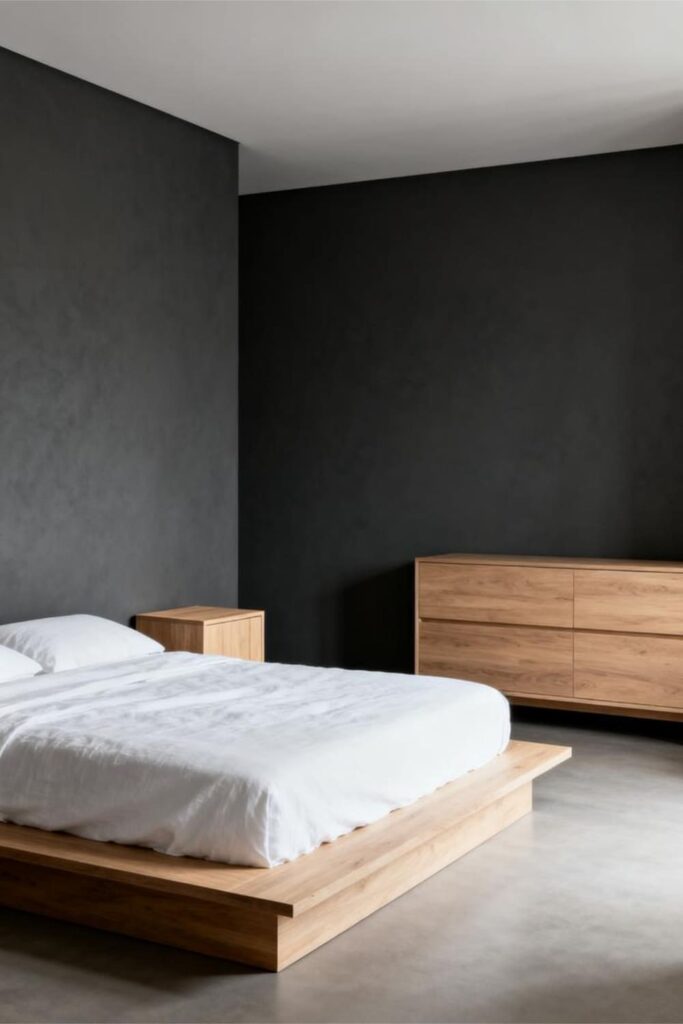
Charcoal gray lives comfortably between neutral and bold. It’s sleek, dramatic, and endlessly versatile—like the paint version of a perfectly styled black outfit.
Why Charcoal Gray Stays Under Control
- Offers contrast without overpowering
- Looks sharp with crisp white trim
- Works well in both small and large rooms
If a space feels flat or unfinished, charcoal adds depth almost instantly.
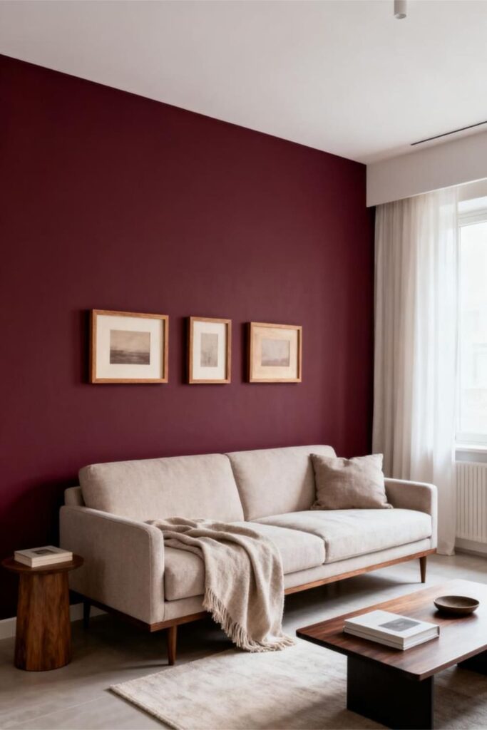
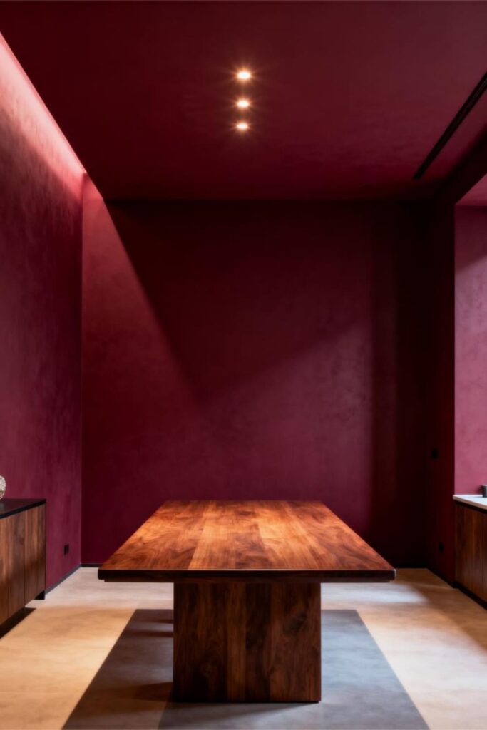
4. Burgundy: The Unexpected Sophisticate
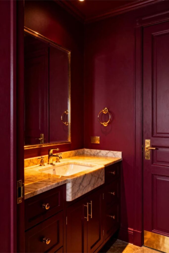
Burgundy has a reputation problem, but modern versions are rich, refined, and anything but dated. When done right, it feels intimate and elegant rather than heavy.
Why Burgundy Works
- Brings warmth and romantic depth
- Pairs beautifully with warm neutrals
- Creates a cozy, enveloping atmosphere
Where Burgundy Pops
- Powder rooms
- Dining rooms
- Bedrooms
It’s dramatic in a polished, grown-up way.
5. Mustard Yellow: The Retro Rebel
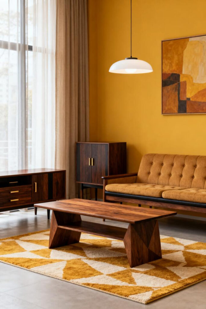
Mustard is the bold choice for anyone who wants warmth and personality without eye-straining brightness. It’s cheerful, slightly quirky, and full of charm.
Why Mustard Works Without Overdoing It
- Adds warmth without harsh glare
- Complements navy, dark wood, and mid-century styles
- Brightens rooms with limited natural light
It’s fun, confident, and surprisingly easy to live with.
6. Teal: Drama’s Best Friend
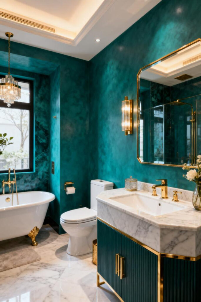
Teal strikes the perfect balance between bold and elegant. By blending blue and green into a jewel tone, it brings richness without aggression.
Why Teal Is Perfect
- Fits modern, boho, and traditional styles
- Adds depth and luxury instantly
- Feels energetic but controlled
It’s one of those colors that simply works.
How to Use Bold Colors Without Feeling Overwhelmed
Color choice matters—but placement and styling matter just as much.
1. Use Bold Colors on Just One Wall
Accent walls remain popular for a reason: they deliver impact without overload.
When an Accent Wall Wins
- Small rooms needing warmth
- Behind beds or sofas
- When commitment feels scary
One bold wall plus light surrounding walls keeps things balanced.
2. Pair Bold Walls With Light, Airy Furnishings
To avoid a cave-like feel, contrast bold walls with lighter pieces.
Try This Combo
- Navy walls with white furniture
- Charcoal with light oak accents
- Forest green with cream curtains
Contrast enhances bold color instead of fighting it.
3. Use Bold Shades on Trim or Doors
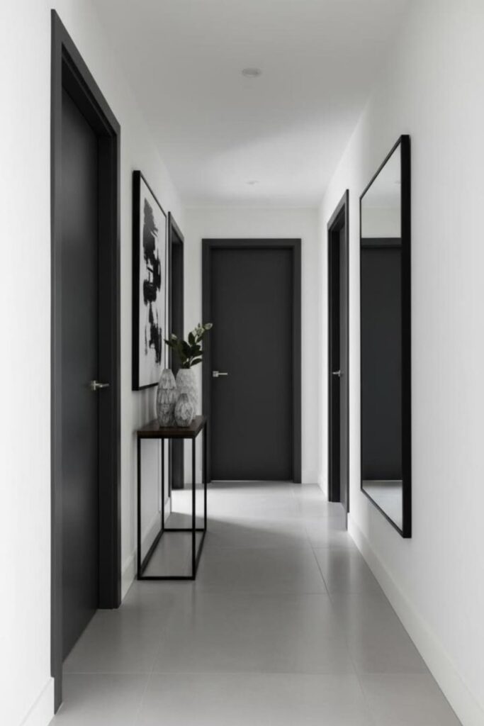
For subtle drama, apply bold hues to details instead of full walls.
Great options include:
- Interior doors
- Window trim
- Built-ins
- Baseboards
It’s an easy way to make a space feel custom and modern.
4. Keep Décor Minimal (But Stylish)
Bold walls should be the star. Let décor support them.
Stick to:
- Clean lines
- Neutral accessories
- Soft textures
- Simple artwork
Less competition equals more impact.
5. Choose Bold Colors With the Right Undertones
Undertones are the difference between “wow” and “why does this feel wrong?”
Look for These
- Cool undertones for crisp drama
- Warm undertones for cozy depth
- Muted tones for softness
- Clean undertones for energy
Most color regrets come down to undertones—not the color itself.
6. Use Bold Colors With Good Lighting
Lighting can completely change how a bold color reads.
Types of Lighting That Help
- Warm LEDs for richness
- Natural light for accuracy
- Accent lighting for dimension
Always test colors in your lighting before committing.
The Best Neutral Pairings for Bold Colors
Neutrals keep bold shades grounded and livable.
Reliable Neutral Partners
- Crisp whites
- Warm beiges
- Soft grays
- Natural wood tones
- Muted taupes
Think of them as the support system that lets bold color shine.
Where Bold Colors Make the Most Impact
Some rooms handle drama better than others.
Top Spots for Drama
- Entryways
- Powder rooms
- Dining rooms
- Bedrooms
- Reading nooks
Small or intimate spaces often benefit the most from bold paint.
Common Mistakes to Avoid (So You Don’t Regret Everything)
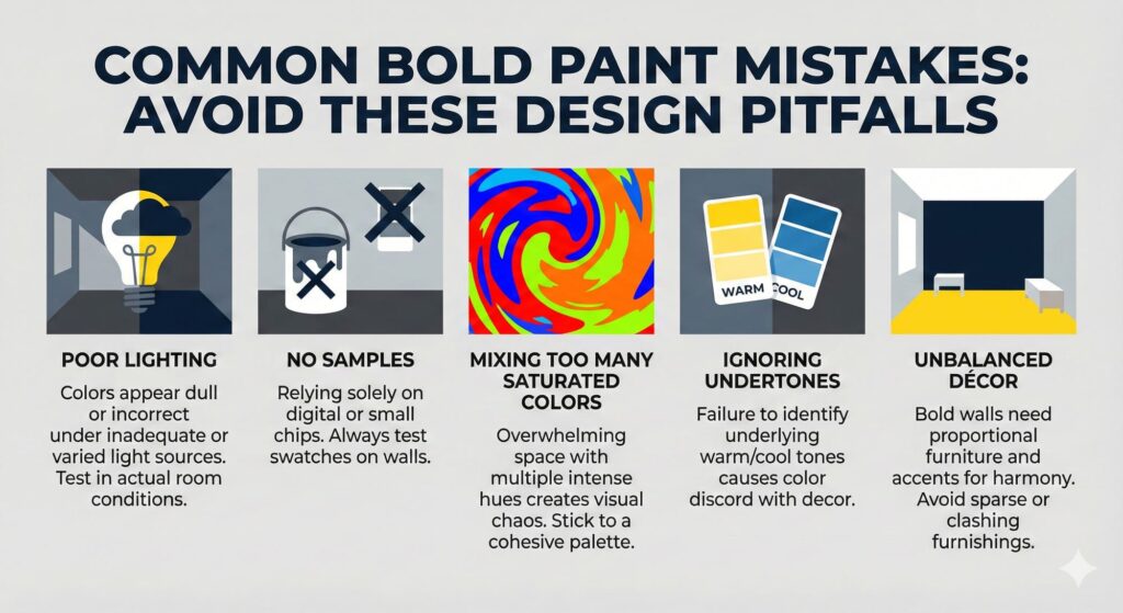
Even confident decorators slip up.
Avoid These
- Using bold colors in poorly lit rooms
- Skipping paint samples
- Mixing too many intense shades
- Ignoring undertones
- Over-decorating bold walls
Fixing these mistakes puts you ahead of most DIY projects.
How to Test Bold Colors Like a Pro
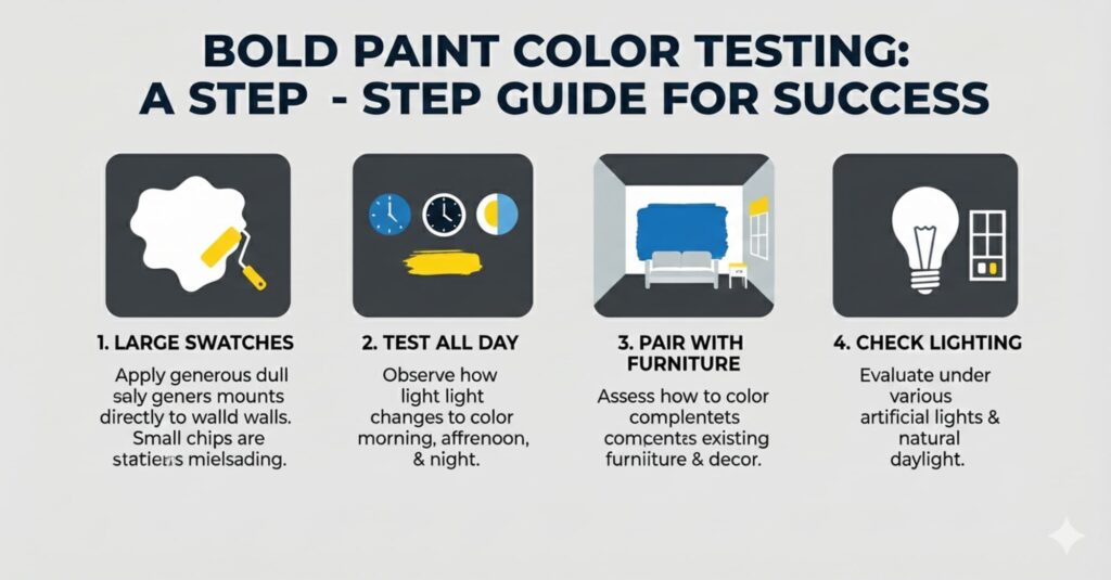
Bold paint deserves extra testing.
Do This Before Committing
- Paint large swatches on different walls
- View them morning, afternoon, and night
- Test with your furniture
- Check under real lighting
It’s worth the effort—you’re shaping your home’s mood.
Final Thoughts: Bold Doesn’t Mean Scary
Bold paint colors bring personality, depth, and unforgettable style—and they don’t have to feel overwhelming. With the right shade, proper lighting, thoughtful placement, and balanced décor, bold colors can feel both dramatic and comfortable.
So take the leap. Sample that forest green. Try that moody navy. Live with it for a bit. When it feels right, commit—and enjoy a space that finally feels alive.
Just don’t be surprised if you start planning your next bold wall.