


Let’s be real—decorating a low-light room can feel like trying to take a decent selfie in a dimly lit café. You squint, move around, adjust angles… and still wonder why the lighting seems personally offended by you.
I’ve been there. And from experience, I can tell you this: nothing rescues a gloomy room faster than the right wallpaper pattern.
On the flip side, nothing wrecks it faster than the wrong one. Ever noticed how some wallpapers instantly brighten a space while others turn it into a shadowy cave? That’s not an accident—and we’re about to break down why.
I’ve tested more wallpaper than I’d like to admit. Some choices transformed rooms beautifully. Others made my living room feel like a medieval dungeon.
So think of this guide as a relaxed coffee chat about what actually works, what absolutely doesn’t, and how to outsmart bad lighting without adding a single extra bulb.
Why Wallpaper Matters So Much in Low-Light Rooms
It’s easy to assume paint can handle low-light issues on its own—but wallpaper does something paint simply can’t. It adds texture, depth, and subtle light-play that changes how a room feels.
Ever stepped into a room with reflective wallpaper and thought, “Wait… did this room always feel this big?” Exactly.
Wallpaper can:
- Reflect available light and brighten the space
- Add structure to walls that feel flat
- Bring personality without overwhelming the room
- Trick the eye into seeing more depth
Of course, it can also do the opposite—making a room feel darker, smaller, and heavier. Let’s make sure that doesn’t happen.
The Best Wallpaper Patterns for Low-Light Rooms
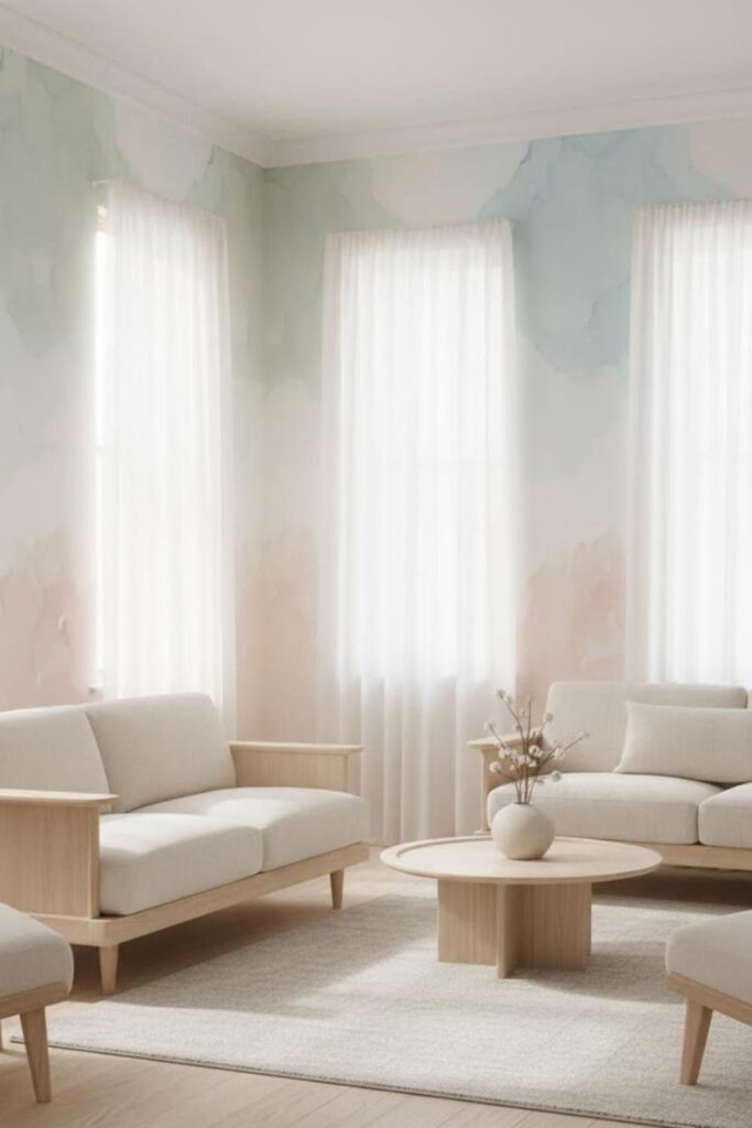
1. Light-Colored Patterns That Bounce Light
This may sound obvious, but you’d be amazed how often people reach for “moody neutrals” and accidentally lock themselves into permanent evening mode.
Light-colored wallpaper does two critical things:
- It reflects whatever little light your room receives
- It keeps the visual energy feeling open and fresh
That’s why white kitchens still look bright even on gloomy days—the same principle applies here.
Great options include:
- Soft whites with subtle geometric lines
- Pale beige or cream botanical prints
- Icy blue abstract washes
Bold Tip: Look for patterns with a gentle sheen. Not high-gloss—just enough to catch natural light and quietly brighten the room.
2. Micro-Prints That Don’t Overwhelm
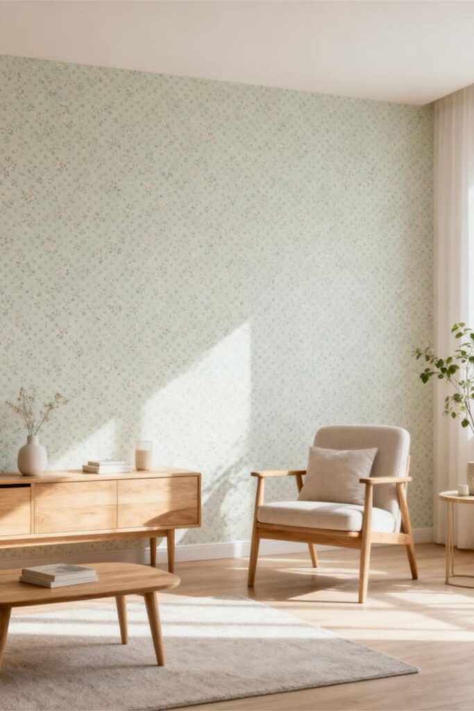
Those wallpapers that look simple from afar but reveal intricate detail up close? That’s where micro-prints shine.
Small-scale patterns are perfect for low-light rooms because they add interest without visually weighing the space down.
Micro-prints help because they:
- Keep rooms feeling open
- Add texture without drama
- Avoid heavy contrast that absorbs light
Ever wondered why tiny florals can make a room feel cozy instead of cramped? That’s the magic at work.
Patterns to look for:
- Tiny florals
- Small polka dots
- Fine stripes
- Narrow lattice designs
FYI: Micro-prints are ideal if you want personality without feeling like you’re living inside a graphic design project.
3. Vertical Stripes (The Underrated MVP)
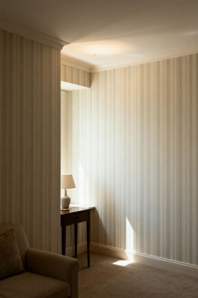
Vertical stripes are seriously underrated in low-light spaces. I once used soft taupe stripes in a north-facing bedroom—and suddenly the ceiling felt taller and the room felt brighter.
Yes, I loved that room more than my morning coffee for a solid week.
Vertical stripes:
- Create the illusion of height
- Add structure to walls
- Pull attention away from limited natural light
The key is subtlety. Stick with light backgrounds and softly toned stripes. High-contrast stripes may look bold, but in dim rooms they can feel a little… circus-tent-ish.
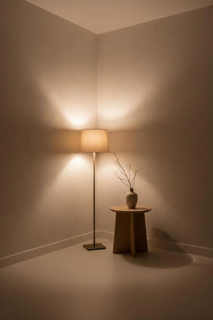
4. Subtle Metallics That Catch the Light
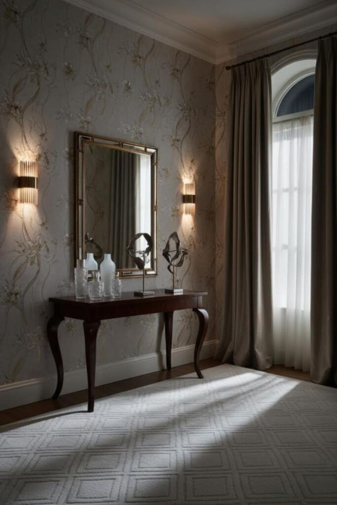
No, I don’t mean mirror-finish silver that blinds you at sunset—unless that’s your thing.
Soft metallic accents like champagne gold, pearl, or muted copper gently bounce light around the room, creating a warm glow instead of harsh shine.
Metallic wallpaper details:
- Create a luminous effect
- Add elegance without heaviness
- Make dim rooms feel intentional
Think about how candlelight reflects off metallic surfaces—that same softness works beautifully here.
Great metallic styles include:
- Gold-accented botanicals
- Pearl-finish geometric patterns
- Soft shimmer abstract designs
Honestly, subtle metallic wallpaper is one of the easiest upgrades you can make in a low-light room—no electrical work required.
5. Watercolor & Wash Prints for Soft Diffusion
If your goal is dreamy rather than dark, watercolor-style wallpapers are your best friend. These designs add color without harsh lines, which helps diffuse light instead of fighting it.
Watercolor patterns:
- Soften shadows
- Create gentle movement
- Never feel heavy or cluttered
Think breezy gradients. Think calm blends. Think walls that feel like they just took a deep breath.
Best choices include:
- Pale blue washes
- Blush-toned gradients
- Soft green watercolor botanicals
I once used a sage watercolor wallpaper in a hallway—and it instantly went from “tunnel” to “spa walkway.” Highly recommended.
Patterns to Avoid in Low-Light Rooms
Now let’s talk about what not to use—the styles that drain light faster than you can say, “Why does this room feel smaller?”
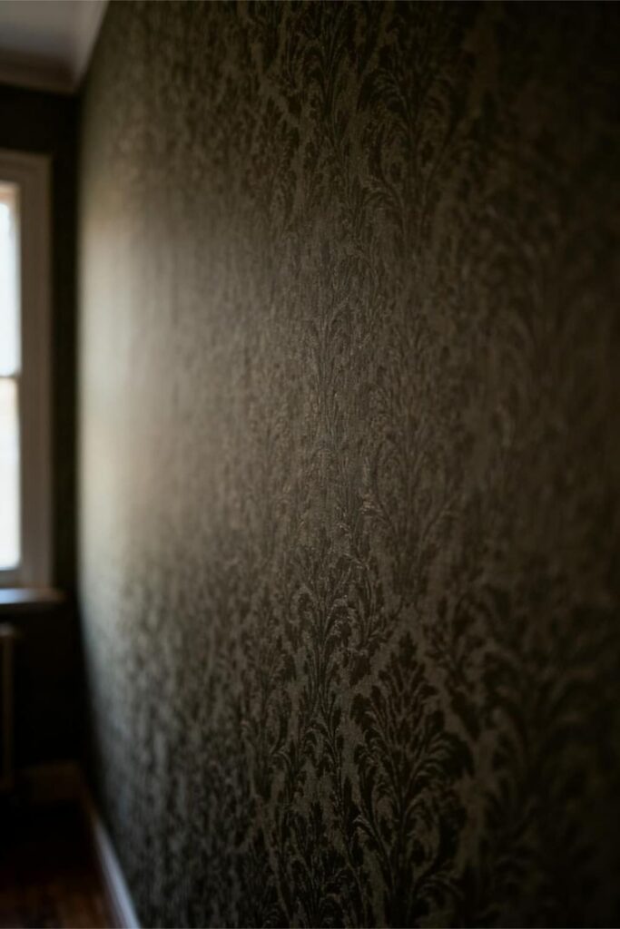
1. Dark, Heavy Backgrounds
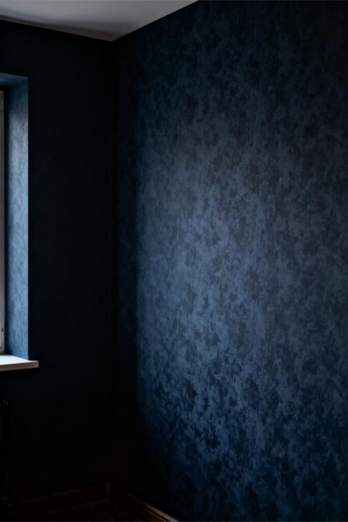
Dark wallpaper may look luxurious online, but in real-life low-light rooms, it absorbs light like a black hole.
Dark backgrounds tend to:
- Flatten the room
- Make walls feel closer
- Eliminate reflectiveness
Unless your goal is a deliberate cave aesthetic, it’s best to steer clear.
2. Large-Scale Prints That Dominate the Wall
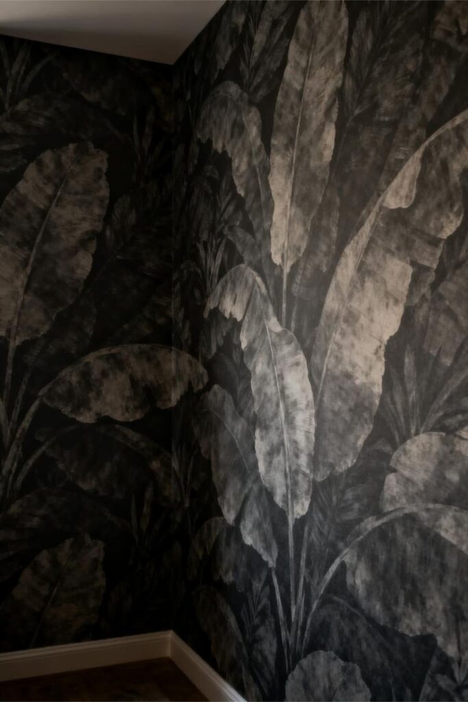
Oversized florals and giant botanicals can look incredible in sun-filled spaces. In low-light rooms, though, they feel overwhelming—almost looming.
Large-scale prints:
- Take up too much visual space
- Overpower small or dim rooms
- Make corners feel darker
If your wallpaper feels like it’s staring back at you, it’s probably too big.
3. High-Contrast Patterns That “Buzz” in Dim Light
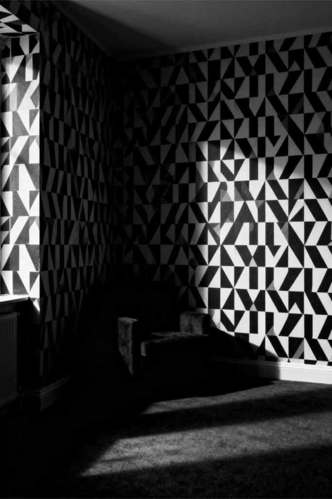
Bold contrasts like black-and-white or navy-and-gold need strong light to shine. Without it, they create visual tension that feels tiring rather than stylish.
High-contrast patterns often:
- Make rooms feel chaotic
- Emphasize shadows
- Create harsh visual breaks
Your eyes end up working overtime—and not in a fun way.
4. Heavy Textures That Absorb Light
Fabric wallpapers, deep embossing, and woven textures look luxurious—but they soak up light instead of reflecting it.
In low-light rooms, this can make walls feel dull and muddy. Texture adds depth only when there’s enough light to interact with it—and here, that light just isn’t available.
How to Choose the Right Wallpaper When Light Is Limited
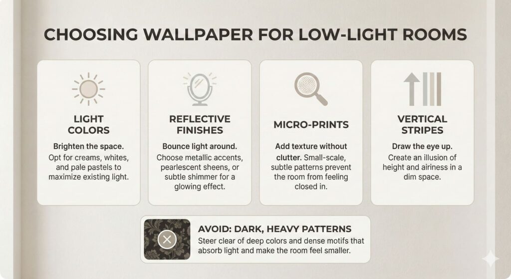
Here’s a quick cheat sheet you can screenshot, save, or mentally keep in your back pocket.
Choose wallpapers that are:
- Light-colored
- Slightly reflective
- Fine-patterned
- Softly colored
- Vertically oriented
Avoid wallpapers that are:
- Dark
- Oversized
- High contrast
- Heavily textured
Key Rule: If a wallpaper sample makes the room feel smaller the moment you tape it up—walk away.
Extra Tips to Boost Light—Even If Your Room Doesn’t Have Any
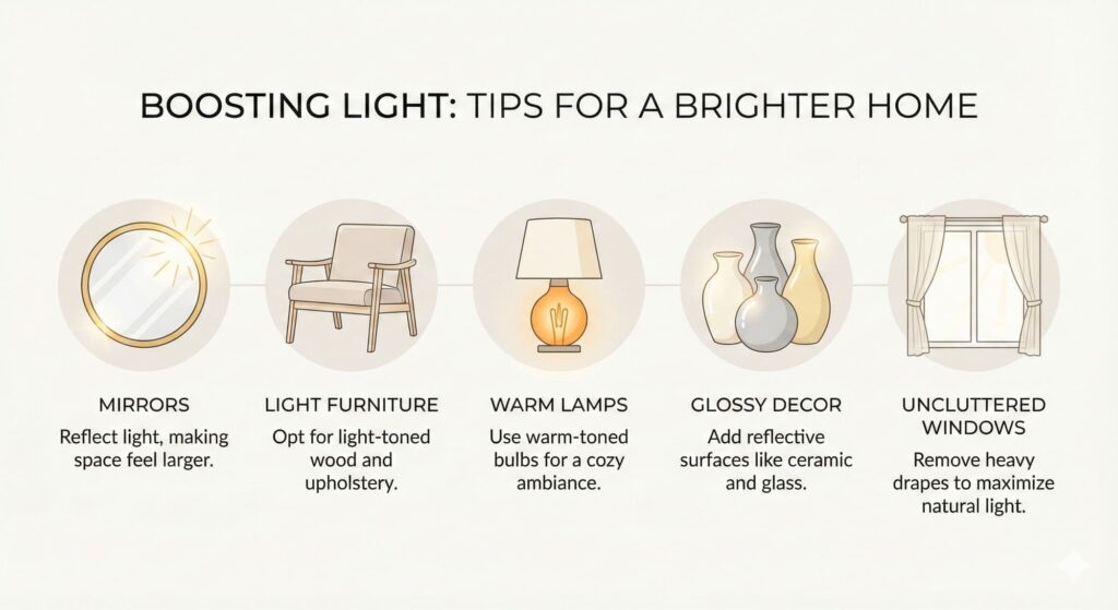
Wallpaper does most of the work, but these extra tricks help amplify the effect:
1. Pair with Light Furniture
White and natural wood furniture reflect light beautifully off wallpaper.
2. Add Mirrors
A mirror opposite a subtly metallic wall is an instant glow-up.
3. Choose Warm Lamps
Warm bulbs enhance pale wallpapers. Cool light can feel harsh and flat.
4. Keep Windows Uncluttered
Even one small window can help—don’t suffocate it with heavy curtains.
5. Use Glossy Decor
Glass, ceramic, and metal accessories reflect light in soft, flattering ways.
Final Thoughts: Light Up Your Low-Light Room the Smart Way
Low-light rooms don’t have to feel gloomy or forgotten. With the right wallpaper—patterns that reflect light, stay soft, and keep things airy—you can completely change the mood of the space.
Remember:
- Light colors brighten
- Micro-prints calm
- Metallics glow
- Vertical stripes lift
- Dark, heavy patterns stay far away
Grab a few samples, tape them up, and watch how the room transforms. Your walls are about to get a serious glow-up.
And who knows? You might even start loving that low-light aesthetic—just the good version this time.